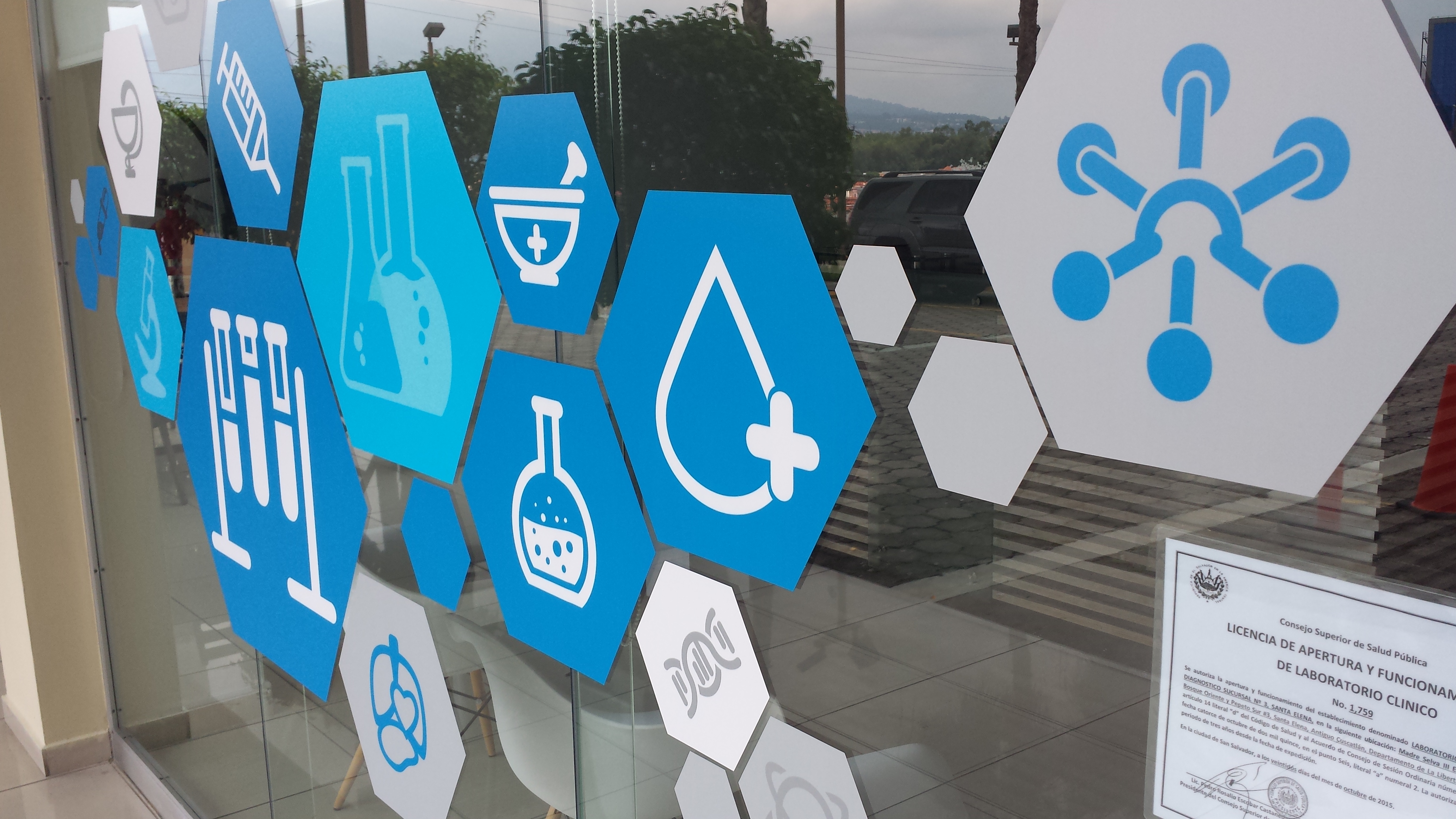
In 2014, as MedicSana was still in the “coffee-shop” phase of early start-ups, Pablo Bucio designed a blue hexagonal logo.
We used blue, a nice soothing (though extremely generic) healthcare color, but the box shape was more of a nod to the “box” aspect of our value proposition. The original plan for MedicSana involved the metaphorical “Cajas Fuertes,” or “strong boxes,” (like a safe) for storing money long term and “Cajas Populares,” or “Popular boxes” for collecting money in the community for a person in need.
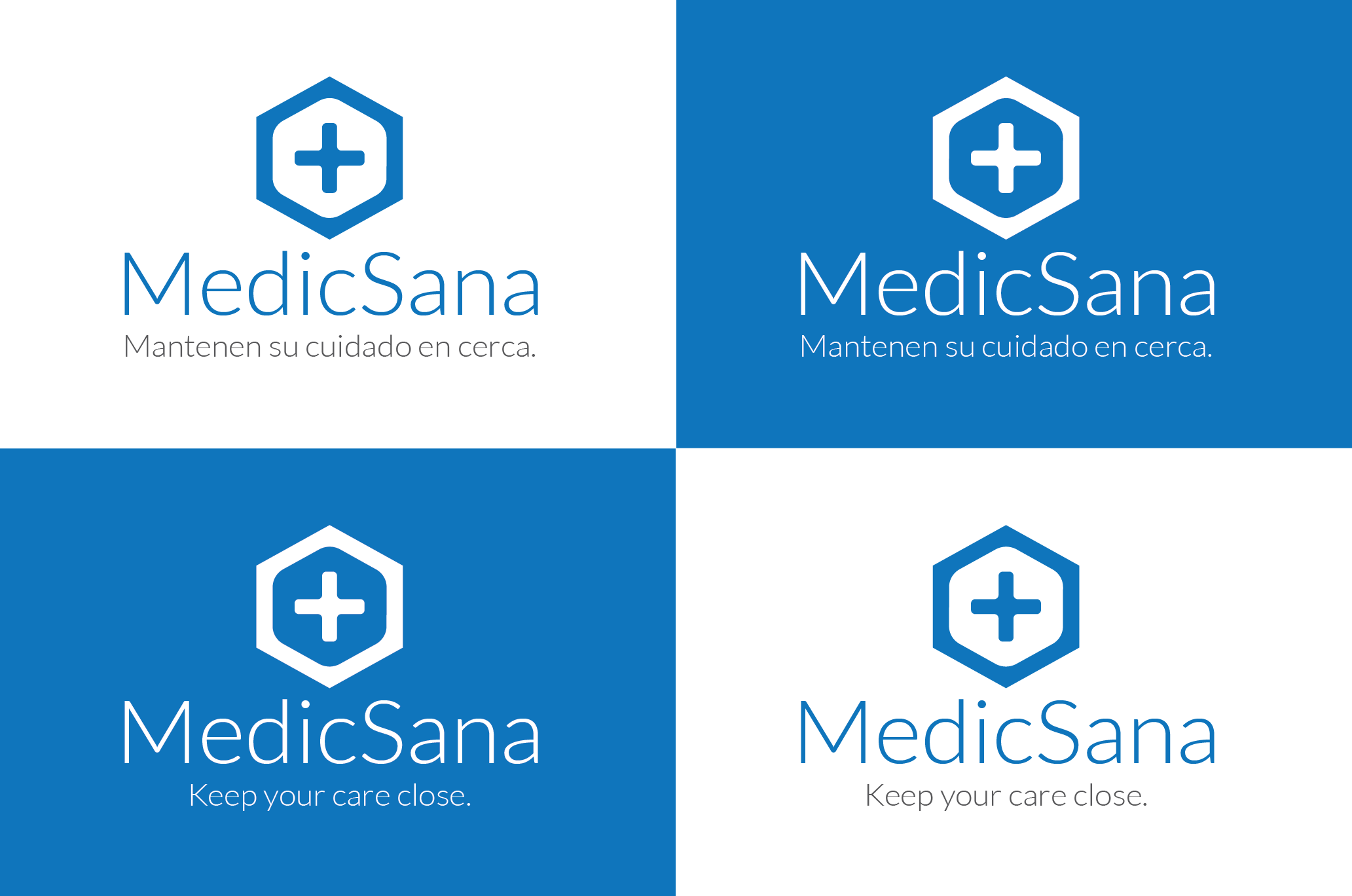
At the time, Pablo wanted to use the hexagon – an uncommon shape in graphic design outside of technical things – for both the nod to the box shape, but also the way that hexagons form together like a hive. Bees have been a staple for understanding community from Charles Darwin to Jonathan Haight and Stephen Hall. Indeed, for us, the metaphor of a bee was strong as some “left the nest” to go gather while others stayed at home for production.
 Little did we know that over the coming years, for different reasons, the blue hexagon would be adopted throughout the health industry for other reasons.
![]()


Medicine doctor hand working with modern computer interface as medical concept

![]()